Available for work · Seville, SpainDisponible para trabajar · Sevilla, España
David Lopez
UX/UI designer. I studied Immersive Reality at SCAD in Savannah on a tennis scholarship, and then the UX/UI programme at CEI in Seville.Diseñador UX/UI. Estudié Immersive Reality en SCAD, en Savannah, gracias a una beca deportiva de tenis, y después el Experto en UX/UI en CEI, en Sevilla.
The case studiesLos casos
Case study 01
MADA
C2C circular fashion · Gulf region · 2026 · End-to-end UX/UI, Double DiamondModa circular C2C · Golfo Pérsico · 2026 · UX/UI de principio a fin, Doble Diamante
The problemEl problema
The Gulf has no dedicated fashion resale platform. The "Vinted effect" simply never arrived. Up to 90% of textiles end up in landfill for lack of collection and resale systems, while generic classifieds like Dubizzle and Haraj feel cluttered and unsafe for fashion.En el Golfo no existe ninguna plataforma dedicada a revender moda. El "efecto Vinted" nunca llegó hasta allí. Hasta el 90% del textil acaba en vertederos por falta de sistemas de recogida y reventa, mientras los portales generalistas como Dubizzle o Haraj se sienten desordenados y poco fiables para comprar ropa.
ResearchInvestigación
Desk research, netnography across Reddit, X and the App Store, plus a surveyInvestigación documental, netnografía en Reddit, X y la App Store, más una encuesta
78% of Saudi e-commerce happens on a smartphoneEl 78% del comercio electrónico saudí ocurre desde el móvil
64% try to sell unused clothes, and the top barrier is fear of scamsEl 64% intenta vender ropa que no usa, y lo que más les frena es el miedo a que les estafen
66% rate app aesthetics as "very important"El 66% considera "muy importante" la estética de la app
58% of GCC consumers seek sustainable emotional gratificationEl 58% de los consumidores del Golfo busca una recompensa emocional sostenible
Who it's forPara quién es
Sara, 32, Bahrain, marketing. Wants to sell fast and safely, and worries about not getting paid.
Zaid, 22, Saudi Arabia, tech student. Tired of dated classifieds, wants real filters and privacy.Sara, 32, de Baréin, trabaja en marketing. Quiere vender rápido y sin sustos, y le da miedo no cobrar.
Zaid, 22, de Arabia Saudí, estudia tecnología. Está harto de portales anticuados y quiere filtros de verdad y privacidad.
Design responseRespuesta de diseño
Escrow payments that hold the money until delivery is confirmedPago retenido, de forma que el dinero no se libera hasta confirmar la entrega
Protected in-app chat, so no phone number is ever sharedChat protegido dentro de la app, sin dar nunca el número de teléfono
Fashion-specific filters: size, brand, conditionFiltros pensados para moda: talla, marca, estado
Integrated home pickup and delivery logisticsRecogida a domicilio y logística integradas
Premium minimalist UI to strip the "cheap secondhand" stigmaInterfaz minimalista y premium para quitarle el estigma de "ropa usada barata"
Palette & typePaleta y tipografía
#2E5BFFElectric Blue for CTAs and payment states, so it reads as technical securityElectric Blue para botones y estados de pago, porque se lee como seguridad técnica#F9F8F3Alabaster White as a gallery-like backdrop for the product gridAlabaster White como fondo de galería para la rejilla de producto#231F20Charcoal Black for text and overlays, premium without the harshness of pure blackCharcoal Black para texto y capas, premium sin la dureza del negro puro
The palette does most of the work on the core problem. Users confirmed it removes the "used clothing" stigma and reads as a premium boutique.La paleta es la que carga con el problema de fondo. Los usuarios confirmaron que quita el estigma de la ropa usada y que se lee como una boutíque premium.
100%Task completion, 10/10 usersDe éxito en tareas, 10 de 10 usuarios
0Users needing guidanceUsuarios que necesitaron ayuda
19Pages of documented processPáginas de proceso documentado
Interactive prototypePrototipo interactivo
Click through the buy and sell flows. This is the same build the ten usability testers used.Recorre los flujos de compra y venta. Es la misma versión que usaron los diez participantes del test.
Collaborative travel planning · 2025 · UX research, IA, prototypingPlanificación de viajes en grupo · 2025 · Research UX, arquitectura de información, prototipado
The problemEl problema
Travellers juggle one app for packing, another for bookings, another for activities and notes. Things get forgotten, time gets lost, and what should be exciting turns stressful before the trip even starts.Los viajeros usan una app para la maleta, otra para las reservas, otra para los planes y las notas. Se olvidan cosas, se pierde tiempo, y lo que debería ilusionar acaba agobiando antes incluso de salir de casa.
ResearchInvestigación
Four personas built from the distinct ways people travelCuatro perfiles construidos a partir de formas muy distintas de viajar
Competitive teardown of PackPoint, TripIt and TripsyAnálisis a fondo de PackPoint, TripIt y Tripsy
PackPoint, great packing generator, weak itineraries, no collaborationPackPoint, buen generador de equipaje, flojo en itinerarios y sin nada de colaboración
TripIt, auto-imports bookings, but has no packing checklist at allTripIt, importa las reservas solo, pero no tiene lista de equipaje
Tripsy, nice UI, but the packing list sits behind the paywallTripsy, interfaz cuidada, pero la lista de equipaje está de pago
Mind map and sitemap before wireframes, then high-fidelity FigmaMapa mental y sitemap antes de los wireframes, y después alta fidelidad en Figma
Who it's forPara quién es
Maria, 27, busy professional who needs a trip set up in minutes.
Daniel, 24, first-time traveller who doesn't know what to pack and worries about losing documents.
Carla, 39, packs for a family of four and shares the trip with her husband.
Alex, 28, adventure seeker who needs it working with no signal.María, 27, profesional sin tiempo, necesita montar un viaje en minutos.
Daniel, 24, primer viaje, no sabe qué meter en la maleta y le preocupa perder los documentos.
Carla, 39, prepara el equipaje de cuatro y comparte el viaje con su marido.
Alex, 28, aventurero, lo necesita funcionando sin cobertura.
Design responseRespuesta de diseño
Step-by-step trip creation: destination, dates, activitiesCreación del viaje paso a paso: destino, fechas, actividades
Packing checklist generated from destination, duration and weatherLista de equipaje generada según destino, duración y clima
Multi-bag organisation with visual packing progressOrganización por bultos con progreso visual de la maleta
Budget tracker with a spending capControl de presupuesto con límite de gasto
Share a trip by link, and full offline accessCompartir el viaje por enlace, y acceso completo sin conexión
Palette & typePaleta y tipografía
#6AE8A7Mint for primary actions and trip cards, the app's signatureMint para acciones principales y tarjetas de viaje, el sello de la app#5DCB92Deep Mint for pressed and secondary statesDeep Mint para estados pulsados y secundarios#000000Black for date pills and labels, maximum contrast on mintBlack para las píldoras de fecha y etiquetas, máximo contraste sobre menta#B8DAF5Sky drawn from the destination photography, not a fixed brand colourSky sacado de la fotografía del destino, no es un color de marca fijo
Full-bleed destination photography carries the emotion. The mint and black UI sits on top of it without competing.La fotografía del destino a sangre completa es la que aporta la emoción. La interfaz en menta y negro se apoya encima sin competir con ella.
4Personas driving the featuresPerfiles que guiaron las funciones
3Competitors dissectedCompetidores analizados
93Pages of documented processPáginas de proceso documentado
Interactive prototypePrototipo interactivo
Walk through creating a trip, from destination and dates to the packing list it builds for you.Recorre el alta de un viaje, desde el destino y las fechas hasta la lista de equipaje que te genera.
Ordering website · Espartinas, Sevilla · 2026 · Self-initiated, designed and codedWeb de pedidos · Espartinas, Sevilla · 2026 · Proyecto propio, diseñado y programado
The problemEl problema
A neighbourhood kebab shop with no storefront of its own: orders arrived by phone or through Glovo, Just Eat and Uber Eats, each taking a cut and owning the customer relationship. I built it a direct channel on my own initiative, as a pitch.Un kebab de barrio sin escaparate propio: los pedidos le entraban por teléfono o vía Glovo, Just Eat y Uber Eats, cada uno llevándose su comisión y quedándose con la relación con el cliente. Le construí un canal directo por iniciativa propia, a modo de propuesta.
Where it standsEn qué punto está
Self-initiated: designed and coded speculatively for a real shop, not commissionedIniciativa propia: diseñado y programado por mi cuenta para un local real, sin encargo previo
The handover never closed, so the live site routes orders to my own phone rather than theirsLa venta nunca llegó a cerrarse, así que la web envía los pedidos a mi móvil y no al suyo
It is a working build rather than a mockup. The flow, the cart and the ordering all runEs una versión funcionando y no una maqueta. El flujo, el carrito y el pedido corren de verdad
Constraints came from the real business: its menu, split opening hours and the platforms it already sold onLas restricciones salieron del negocio real: su carta, su horario partido y las plataformas en las que ya vendía
No formal discovery deck here, unlike MADA and TripMate. The requirements came from the operation itselfAquí no hubo fase de descubrimiento formal, a diferencia de MADA y TripMate. Los requisitos salían de la propia operativa del local
Who it's forPara quién es
The customer, hungry, one hand on a phone, deciding in under a minute. Not browsing, not comparing.
The shop, which needs the order to land somewhere it already watches during service, without new software to learn mid-rush.El cliente, con hambre y una mano en el móvil, decidiendo en menos de un minuto. Ni navega ni compara.
El local, que necesita el pedido donde ya está mirando durante el servicio, sin aprender software nuevo en plena hora punta.
Design responseRespuesta de diseño
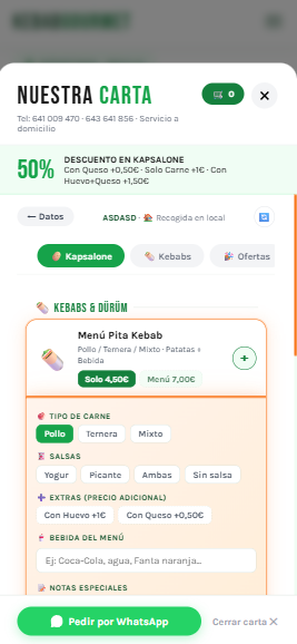
One flow you can run with a thumb. Pick, customise, orderUn flujo entero que se hace con el pulgar. Elegir, personalizar, pedir
Extras and sauces as chips instead of dropdowns, so nothing is hiddenExtras y salsas como fichas en vez de desplegables, para que no haya nada escondido
Persistent cart and an order button that never leaves the screenCarrito persistente y un botón de pedir que nunca se va de pantalla
Delivery or pickup toggle with an address formSelector de envío o recogida con formulario de dirección
WhatsApp as a real ordering route, not a fallback afterthoughtWhatsApp como vía de pedido de verdad, no como parche de última hora
Honest hand-off to Glovo, Just Eat and Uber Eats for those who prefer themDerivación honesta a Glovo, Just Eat y Uber Eats para quien los prefiera
Palette & typePaleta y tipografía
#F97316Orange the brand colour, reserved for "Pedir Ahora"Orange el color de marca, reservado para "Pedir Ahora"#16A34AGreen for confirm and checkout, kept distinct from the brand buttonGreen para confirmar y pagar, separado a propósito del botón de marca#F0FDF4Mint Wash for selected states and price chipsMint Wash para estados seleccionados y fichas de precio#1A1A1ANear-black for body copy, softer than pure black on whiteNear-black para el cuerpo de texto, más suave que el negro puro sobre blanco
Type is Karla for the interface and Bebas Neue for the discount figures, condensed so a "50%" lands hard without stealing the button's colour.La tipografía es Karla para la interfaz y Bebas Neue para las cifras de descuento, condensada para que un "50%" golpee sin robarle el color al botón.
5Menu categories builtCategorías de carta montadas
3Delivery platforms linkedPlataformas de reparto enlazadas
1Of the three taken all the way to codeDe los tres llevado hasta el código
Built for bothHecho para ambas
Desktop, the landingEscritorio, la landing
Mobile, the orderMóvil, el pedido
Same product doing two jobs. The desktop landing sells the place and the phone takes the order.Mismo producto haciendo dos trabajos. La landing de escritorio vende el local y el móvil recoge el pedido.
I want to work somewhere research actually reaches the interface. If that sounds like your team, the fastest way to reach me is right here.Quiero trabajar donde la investigación llegue de verdad hasta la interfaz. Si eso suena a tu equipo, aquí abajo tienes la forma más rápida de escribirme.